Hear this blog post read aloud:
In March, Aoife Greenham, a local children’s book author and illustrator, led us in a powerful and memorable session exploring our feelings about colours and our emotional responses to them.
Afterwards, with a heightened awareness of all the colours around me, I started musing about how much we use colour as a way of communicating in our everyday lives, sometimes without us really being aware of it. This led me to planning a session with this as a theme, taking learning about colour in childhood as a starting point for our discussion.
I’ve had the pleasure over the last five or six years of spending time with my three little great nephews, reading to them and playing with them. They are aged 7, 5 and 3 now. Nowadays, there’s such an emphasis on helping children to distinguish between colours even before they learn to speak! We have lots of brightly coloured children’s toys in primary colours, TV programmes and children’s books. I found a lovely children’s poem by Christina Rosetti, written in the nineteenth century, before children had so much, to share with the group.
What is pink?
A rose is pink
By a fountain's brink.
What is red? a poppy's red
In its barley bed.
What is blue? the sky is blue
Where the clouds float thro'.
What is white? a swan is white
Sailing in the light.
What is yellow? pears are yellow,
Rich and ripe and mellow.
What is green? the grass is green,
With small flowers between.
What is violet? clouds are violet
In the summer twilight.
What is orange? Why, an orange,
Just an orange!

Christina Rosetti, 1872
As we divided into small groups, I suggested we talk about colours in nature, as the poem does, or share memories of learning about colours in our own childhoods, or helping children to learn about colours as an adult. I also shared an article I’d found, Six tips for explaining colors to a blind child, written by Deborah Kent, who is blind herself.
We enjoyed a wide-ranging discussion, as reflected in the lovely variety of writing some of the group have chosen to share with you below.
Jane Graham
Colour

We open our eyes to see
Nature’s colours -
Beauty is what we see
Happiness is what we feel
Blue skies, golden sunshine
Puffy, white clouds
Grey skies, rain in clear drops
Enhanced by silvery lightning
Sparkling stars in a dark sky
Phased moon golden in the sun
Green, brown, red, grey
Look closer
A multitude of unnamed colours
Nature’s brilliance in flowers, fruits
Sea, lakes, rivers, blue, grey, green,
Laced with white luminosity
Our very rich world
Ever renewing itself.

Colours dark, dreary,
Despair and destruction
No happiness here.
Colours for tears, pain, loss,
Sadness in muted shades -
Looking, seeing, wanting, creating
A world empty of nature’s beauty.
The colour spectrum is wide.
What do we choose to see?

Free da-verse
Jean Thompson
In small groups we covered many aspects and discovered that we don’t all see colour in the same way. Is that cardigan blue? Is it green? It turns out that both are right, depending on our own perception. Don’t try to convince the ‘blue’ people that it is green and vice versa!
Many poems about colour seem to be aimed at children, a way to teach them colours, which is interesting. Why do we teach children colours? It must be an important thing to learn. In an article Margaret found, it is clear that it is just as important to teach children colours even if they have been born without sight.
One adult poem which many people know and which I love is the one by Jenny Joseph which starts “When I am an old woman I shall wear purple with a red hat……” Why should we wait until old age to wear colours which are seen as clashing?
On the other hand, there seem to be lots of songs inspired by colours.
- Yellow is the colour of my true love’s hair
- I can sing a rainbow
- Red Red wine
- Lady in Red
- Paint it Black
- Green Green Grass
And so on.
Thinking of my own experience of colour, did it just come into my life in the wonderful psychedelic 60s? There must have been colour in my younger years but I don’t remember that so vividly. Was there colour in the immediate years after World War Two or do we just think that colour was limited then because of films and newsreels of the times, which were in black and white, or was the lack of colour a reflection of the how hard life was at that time? The introduction of colour TV was a marvellous exposure to how much brighter life could be.
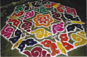
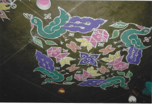
In counties where there is a lot more sun colours seem more vibrant. The fabrics of India and Africa. Market stalls of fruit, vegetables and spices, even in warmer countries of Europe, seem more luscious and full of colour. The exotic flora and fauna of tropical countries, just another example of colour in the sun. Is it just that sunshine brings colours alive? The bright colours of traditional rangoli designs to celebrate the Hindu festival of Divali.
Jean Byrne
Thoughts on the colour red
The topic made me think about how the colour red means different things based on the context in which it is used and to people of different religions and ethnicity. Expressions such as “she saw red” or “a red mist descended” are used to describe someone becoming angry. Red is associated with having a fiery temper and with danger. We might use the phrase “in the red” to describe being in debt or when a failing business posts negative accounts on the stock exchange. In Japan the colour red is considered lucky it is used on the stock exchange to show businesses posting profits. They use green text to show negative accounts. In Japan, red is linked to heroism and protection. It is often used in traditional clothing and decorations, symbolizing strength and courage. The gateway arch at the entrance to temples is often painted red.
Red can also be used in a different more favourable context in England as in the phrase “a red letter day” which is any day of special significance or opportunity. The words “putting out the red carpet” might also be used to mean making a special effort to welcome or impress someone.
In China red is seen as the luckiest colour and symbolizes happiness, good fortune, and prosperity. Brides traditionally wear red dresses, and during celebrations like the Lunar New Year, red envelopes containing money are exchanged as gifts. Red has a similar meaning in the Hindu religion. Brides often wear red during weddings, symbolizing purity, fertility and prosperity. The colour is also associated with the goddess Lakshmi, representing wealth and beauty It is traditional for brides and the groom to wear red garments and flowers

The colour red is often associated with war and revolution. Until the First World War many regiments of the British Army wore red uniforms. Red has become associated with courage, bravery and loss via the emblem of the red poppy. Red has also become the symbol of Socialism and Communist revolution, especially those that took place in Russia and China. It is the colour most used in over 70% of national flags. Red is associated with sacrifice in Christian theology, primarily through the symbolism of blood. The blood of Christ, shed during the crucifixion, represents the ultimate sacrifice for humanity’s sins. The Pope wears a red mantle during many church ceremonies.
Jolene Sheehan
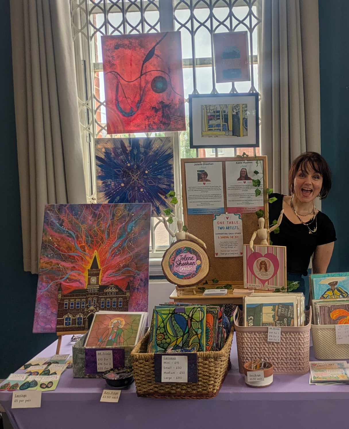
I found myself really struggling to wait my turn during Margaret’s fascinating Stories of Our Lives session on the subject of colour and communication, maybe partly because I’ve become slightly obsessed with colour in my artwork. When I paint, I don’t usually start with a plan. I start with a feeling, or perhaps more accurately, a pull. Sometimes a colour arrives before any understanding of why. I like the simplicity of it and how it often feels as though a small child is directing proceedings:
“Blue.”
“Red.”
“Swirl it.”
“Leaf line.”
The instructions are very short and very firm. I’ve realised this inner child is not at all interested in explaining herself. She simply knows what she wants. This thought makes me smile. As someone who has a habit of overthinking, I like the idea of a freer part of me who doesn’t discuss things, weigh up the options, or produce a project plan. She just confidently points and says, “That one.”
Over the past year or two I’ve noticed that colours have become more important to me. Both in painting as well as in everyday life. In fact, I find myself choosing clothes in the same way I choose paint. Combinations that make me happy on a canvas somehow make me happy when I wear them too. It’s like I am engineering my mood with colour, and this makes me wonder how much colour affects us without us noticing.
A woodland contains an enormous amount of visual information with all the greens, browns, shadows, patches of sunlight and tiny details everywhere. Yet I rarely find it overwhelming. A supermarket, on the other hand, can sometimes leave me wanting a lie down. Perhaps it is because so much modern colour is designed to attract attention. Packaging, signs, screens, adverts and notifications are all competing for our eyes and demanding something from us, subtly or otherwise.
Nature doesn’t seem to be asking anything of me. It simply exists. There’s clearly a drive to live, but it gives in the process of doing so. That is a totally different experience to be around than the more extractive style of visual stimulation created in order to feed the consumerist machine. That reminds me, or the inner child me anyway, of zombies without natural life, feeding on our brains to survive!
I also found myself thinking about children in terms of the Zones of Regulation, where colours are used to help children understand their feelings. Blue, green, yellow and red become a simple language for different emotional states.
It reminded me that adults do this too when we talk about feeling blue, seeing red, or describing things as gloomy and grey. Colour seems to offer us a way of talking about experiences that can be difficult to put into words.
Perhaps that’s why Margaret’s session generated so much discussion. We thought we were talking about colour, but before long we were talking about childhood, family, identity, emotions, memories and the ways we each experience the world. A conversation about colour quickly became a conversation about being human.

 The Stories of Our Lives